出现在按钮、图标附近的数字或者状态标记。
{
  "usingComponents": {
    "mp-cells": "../components/cells/cells",
    "mp-cell": "../components/cell/cell",
    "mp-badge": "../components/badge/badge"
  }
}用于多张图片展示,类似原生的wx.previewImage的展示。
{
  "usingComponents": {
    "mp-gallery": "../components/gallery/gallery"
  }
}加载数据时的 loading 效果
{
"usingComponents": {
"mp-loading": "../components/loading/loading"
},
"navigationBarTitleText": "UI组件库"
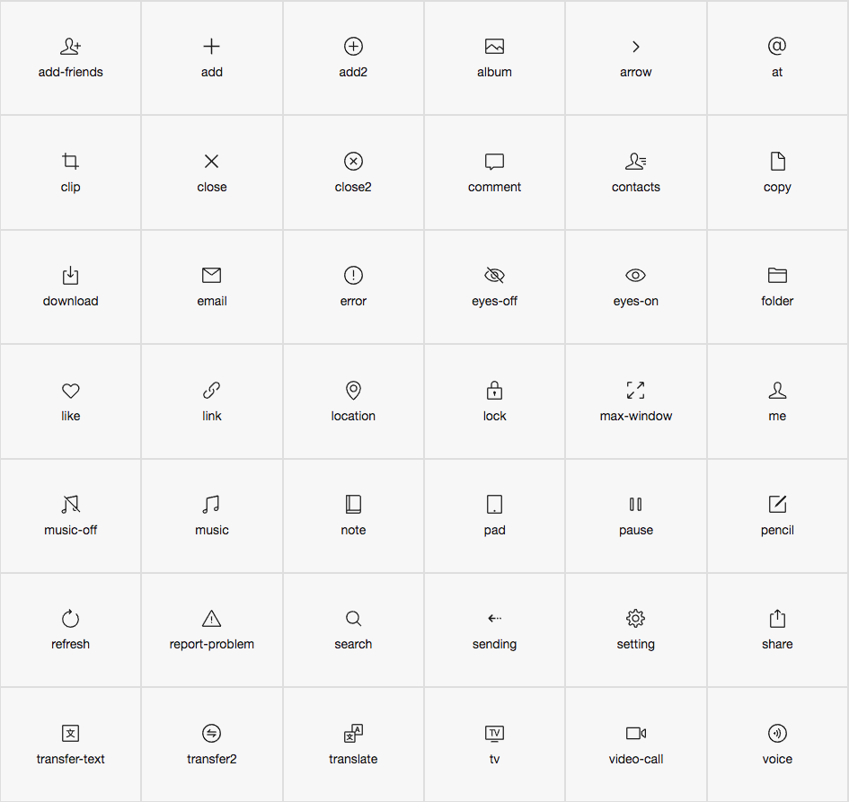
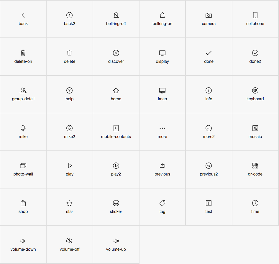
}图标
在 page.json 中引入组件
{
  "usingComponents": {
    "mp-icon": "../../components/icon/icon"
  }
}
<!--WXML示例代码-->
<mp-icon type="field" icon="add" color="black" size="{{25}}"></mp-icon>
<mp-icon icon="add" color="black" size="{{25}}"></mp-icon>
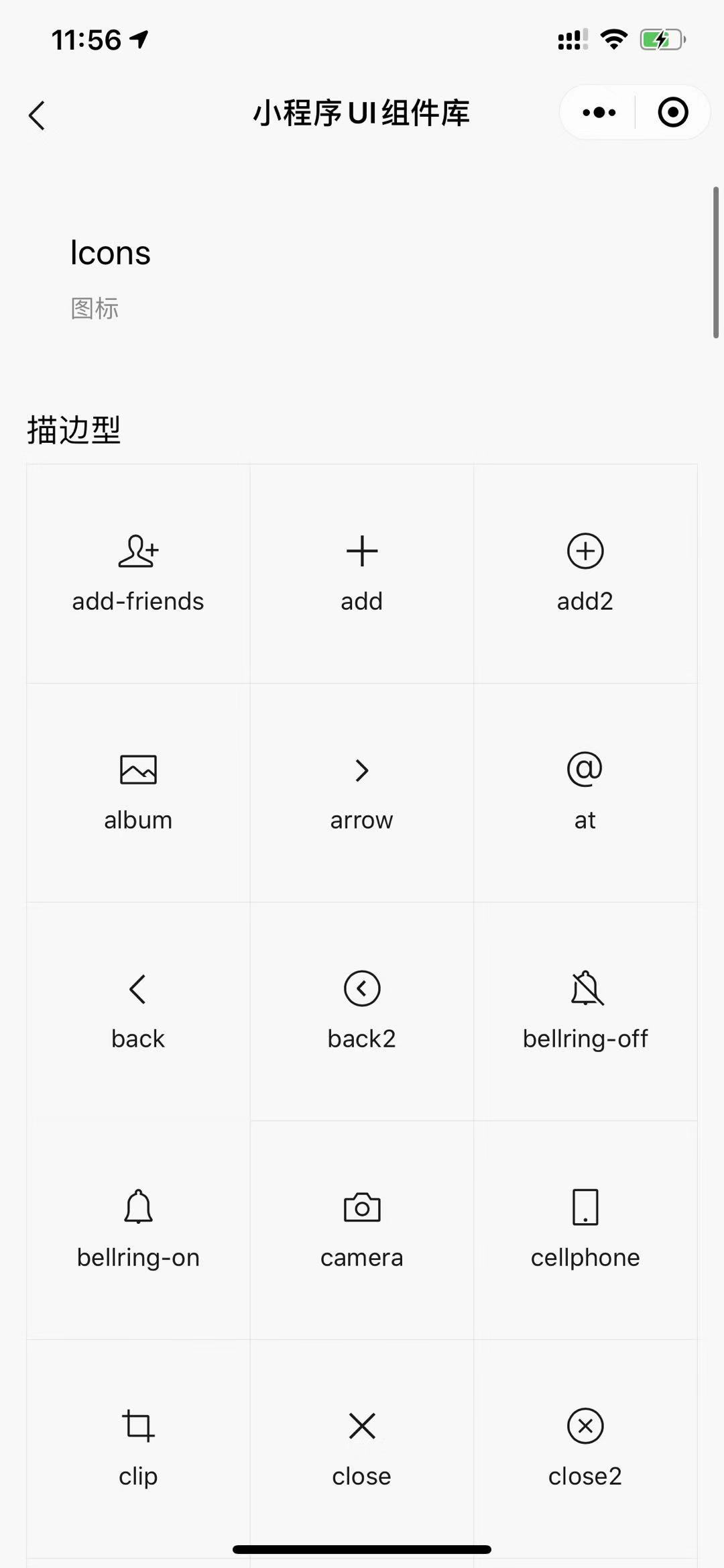
| 属性 | 类型 | 默认值 | 说明 |
|---|---|---|---|
| extClass | string | 组件类名 | |
| type | string | outline | Icon类型,可选值 outline(描边),field(填充) |
| icon | string | Icon名字 | |
| size | number | 20 | Icon的大小,单位 px |
| color | string | black | Icon的颜色,默认黑色 |
© 2023 mianshi8.net MIT license